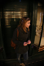
 This was a simple spin on the original poster with the cracked door in the background. It shows a sad Lilly as a focus of the poster. However, the feedback that we recieved stated that it looked unfinished and had some bits missing. It did not completely correlate with the original poster with the tree in it. We recieved positive feedback about the glow around the girl- this makes her look more innocent and pure. It was also said that the glow around 'Monster' would look better in orange along with the other poster.
 This is the 3rd poster idea. It has a picture of Lilly on the round-about smiling and happy. However to contrast the happiness of this poster; the shadow of Lilly (scene from the movie) is on the top corner, on her shoulder. To go along with the other 2 posters the top of the tree branches are located at the very bottom behind the credit block. The feedback we recieved is that the layout of this poster does not look good with the quote on the shadow of Lilly. 'Taylor Cook' also seems to be in the wrong place. The suggestion we got was to move the quote to the top of the credit block and move 'Taylor Cook' to the of the poster. To tie this poster together along with the other ones some orange color is needed.
 This is the updated version from the feedback we recieved. Now the tagline is included like on the other psoters; the glow behind 'Monster' is now orange to stay the same house style with all the posters. I put blowing leaves at the bottom of the picture of Lilly so it brings in some color as well as texture to the over all poster.
Once again I brought in the leaves at the bottom of the page to tie all the posters together. They have a blowing in the wind effect to bring in the theme of the park.

0 Thoughts:
Post a Comment